Your homepage gives people their first impression of your music business. If it looks professional and has clear calls to action, then users are more likely to buy that saxophone or sign up for music lessons.
But if it’s cluttered and hard to navigate, well… good luck convincing them to give you their hard-earned money.
You need to make things easy for your potential customers. To do that, we’ll look at some ways to improve your homepage for better user experience and conversions.

What Makes a Good Music Store Homepage?
As The Website Architect points out, your homepage should answer three fundamental questions about your business:
- Who are you?
- What do you do?
- How can you help me?
If your homepage can answer those questions without scrolling, you’re already in better shape than most other music stores.
Guide Users on a Journey
The other thing you need to consider is the customer journey. Ideally, everything on your website should funnel them towards contacting you or taking some kind of action.
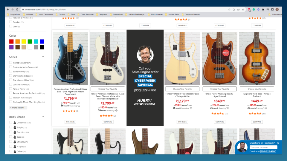
Look at Sweetwater for example: Notice how every page has “Call Your Sales Engineer” prominently displayed somewhere? Or how they end every one of their YouTube videos with that phrase?
(Hint: It’s how they make most of their sales.)

Think of how you make the most money. Then try guiding users to do that thing:
- If all your sales are in-store, your homepage (and the rest of your website) should be constantly inviting people to call or visit your store.
- If you run a music school, “sign up for lessons” should be the main call-to-action on every page.
- If e-commerce is your thing, your homepage design should be encouraging users to add things to their cart.
4 Ways to Improve Your Homepage
Still with me? Good. Now let’s get to the juicy bit.
Here are some dead-simple ways you can improve your music store website’s homepage:
1. Get Rid of Clutter
When someone visits your house, you want it to look clean and inviting. If it’s cluttered and messy, it’ll leave a bad impression on your guests.
Your website’s the same way. If it’s unorganized, out-of-date, and hard to navigate, visitors will tune out and click the back button.
Not everything has to be on your homepage. Here are some quick tips to reduce clutter:
- Remove unnecessary images — Too many images and animations can slow your page down and create a bad user experience. Keep the ones that actually support the text and remove everything else.
- Break up your text — Large blocks of text are daunting and sometimes hard to read. Use shorter paragraphs, bullet points, and proper subheadings to get your point across.
- Keep consistent brand colors — You should have 2-3 brand colors, plus black and white for text and negative space. Make sure you have a consistent “action” color for buttons and links.
2. Update Your Main Heading
Going back to those three questions I mentioned at the beginning: Does your homepage tell people what you do?
People go to websites to solve a problem. The very first headline on your website should tell them exactly what you do and how you can help them.
There should be no question about what you do.
For example, the first headline on my homepage says in no uncertain terms, “SEO, Content, and Web Design Services For Music Industry Professionals”.
Here’s another example from one of my client’s websites:

See what I’m getting at?
If you’re vague about what you do, you’re losing customers. Plain and simple.
3. Make a Direct Call to Action
There should be one obvious button to press on the homepage. It doesn’t have to be the only button. But if there’s one thing you want customers to do, make that the most obvious thing.
- Call Today
- Order Now
- Schedule an Appointment
- Shop Now
- Start Here
- Download Now
Some customers are ready to make the call or pull out their wallets. But they don’t do it because you’re not inviting them to.
By not making a direct call to action, you deny someone the opportunity to engage with your business.
Even if they’re not ready to take action, you need to make your intentions clear. Once they are ready, they’ll know where to go.
4. Don’t Use Carousels & Sliders
You know those slideshow-looking sections? Tons of websites have them at the top of their homepage.
Turns out, they’re pretty terrible for conversions.
For one, you’re hiding essential information from your visitors. The extra friction prevents them from seeing it.
And even if it’s on auto-play, most people will have scrolled past it before the next image appears.
If it’s important enough to put on the homepage, put it somewhere people will actually see it.
Even way back in 2013, a study by Notre Dame concluded that 84% of carousel clicks happened on the first slide.
In simple terms, you’re wasting precious real estate with carousels and sliders. So relocate that information somewhere else on your homepage.
What Are You Waiting For? Improve Your Homepage Now
These are all relatively simple things you can implement yourself. But if your music business needs extra help, shoot me a message. I provide web design and SEO services for music retailers, music schools, and other arts-related businesses. Together, we can take a holistic look at your homepage and find ways to improve it.
