At the start of 2023, I re-joined the Summerhays team as a digital marketing consultant. They had just lost their marketing manager, and no one was actively managing the website.
So I had to quickly pick up the pieces and keep everything up and running.
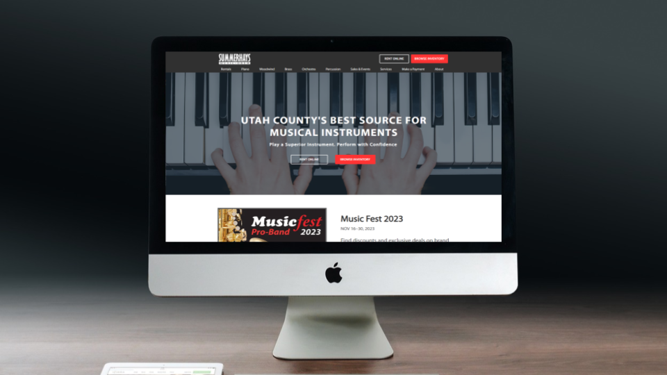
I also wanted to overhaul the Summerhays Orem website and dramatically increase its organic traffic. And so began the year-long process to optimize it.
Why?
When auditing the Summerhays Orem website, I determined it suffered from some key issues:
- An over-designed layout that was busy, cluttered, and just plain messy.
- Vague copywriting and thin content on all the main pages.
- Nothing made with SEO in mind.
- Unfinished pages and broken links.
- General lack of polish, which made the site look unprofessional.
Addressing these would greatly improve the user experience and get the site into more local search results.
My Approach to Web Design
I’ve built, designed, and redesigned several websites from my personal portfolio. Plus, I did SEO and copywriting for at least 80 other websites through various agencies. So I’ve learned a thing or two about good web design.
These are some general guidelines I try to follow when building websites:
- Design your site to be mobile-friendly — This sounds incredibly obvious in 2024. But it’s still shocking how many websites look great on desktop, only to be a horrible experience on smartphones.
- Stick to four brand colors — Use one main color, a contrasting color for links and buttons, then black & white for the text and background.
- Keep things clean — Too much clutter is bad for user experience. It can also negatively affect site performance. Plus, it just looks tacky and unprofessional.
- Clear & concise copywriting — Use short sentences. Avoid large blocks of text. And don’t be overly “cute”, “clever”, or “witty” with your copywriting.
- If it’s not ready to show, don’t show it — Don’t have any “coming soon” pages. It’s a relic of the 90s-era internet that needs to die. The only exception is if it’s deliberate marketing with a planned launch date.
Every Way I Optimized the Website
Here’s everything I did to make the site better. These aren’t step-by-step instructions to follow. Just ongoing things that I’m constantly working on.
1. Publish Time-Sensitive Content
Users need accurate and up-to-date information. So current sales and promotions will always take priority over everything else.
We try to funnel as many people as possible to these promotion pages using outbound marketing (social media, ads, flyers, etc.).
That, and it helps build awareness for anyone else who visits the site for other reasons.
2. Clean Up the Header, Footer, and Main Navigation
Before, these were incredibly messy. The header had lots of unnecessary text, most of which could be moved to the footer.
Plus, Summerhays doesn’t do any online sales — everything’s done in-store. So the shopping cart and log-in buttons did absolutely nothing of value.
It was even more crowded on mobile devices.
The main navigation also needed a refresh. Some items could be consolidated or rearranged. Other submenu items led to half-baked content that wasn’t ready to show.
Here’s the before and after
Before:

After:

The header is way less noisy now, which makes the two action buttons on top more prominent and clickable.
Menu items have been updated or rearranged, and some have been consolidated into drop-down items.
I applied the same ideas with the footer too.
3. Optimize Existing Pages
Most of the service pages were vague and offered very little satisfying information. Lots of them didn’t have any calls to action either (i.e. “Call Now” or “Contact Us Today”).
So I made sure to do the following on every page:
- Update the H1 Headline to better match the service with common Google search terms.
- Flesh out the content within each page. This helps users understand what you offer.
- Add some kind of call to action button or contact form.
4. Add New Service & Info Pages
Summerhays offers plenty of other services that weren’t listed on the website. That, or the service was buried within the content of another page.
Many of them could justify having their own pages. So new ones were added.
These new pages have two major benefits:
- Users can easily find the exact info they’re looking for.
- Search engines will show that page in search results.
5. Delete & Consolidate Low Traffic, Duplicate, and Redundant Pages
It seems counterintuitive to delete pages off your site — especially if you’re trying to rank in search results. More pages = more visibility, right?
But some pages are simply dead weight. They might not provide any value in terms of traffic or revenue. That, and they could even waste time and resources to maintain.
Duplicate pages can also bring unwanted results.
If you have multiple pages for the same thing, you reduce the power of each one in search results.
You could also end up confusing Google and other search engines. As a result, they might not know which one to show in search results. So they just push them down and show your competitors instead.
In this case, Summerhays had many duplicate pages for the same services. Here are two examples:
- For starters, there were four versions of the “band instrument rentals” page. Each one had mostly the same information, but were made at different times for different promotions.
- There were also three separate pages for Piano Tuning, Piano Repair, and Piano Warranty Repairs. All of these could easily be one single page.
There were plenty more examples like this. In each case, I’d consolidate the info into one page, delete the redundant pages, and redirect the URLs to that main page.
The other thing to consider was that Summerhays’ site plan only allowed for a fixed number of pages on the site. Go past that limit and they’d pay $100’s more in web hosting per year.
Ultimately, I’m helping them save money.
6. Overhaul the Online “Store”
As I previously mentioned, Summerhays does almost all their sales in-store. Due to various circumstances, e-commerce isn’t an option for them.
But the website gave the impression that they offered online sales. This did more to confuse and frustrate users than anything else.
The other problem was that they didn’t have a dedicated person maintaining the online store. As a result, prices and information were out of date, and there weren’t any consistent best practices for product descriptions and images.
So I wanted to transform the Online Store into an “Online Catalog” that funnels users to the Contact page.
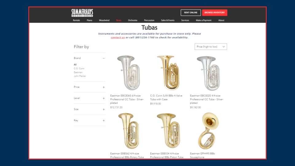
Here are the major changes:
- Remove the “Buy Now” and “Add To Cart” buttons. This prevents user frustration when they try to check out or buy something online.
- Add a CTA to call or visit the store. Everything has to lead to people coming into the store.
- Update and add new products. This includes updating product descriptions, images, and prices. We also added new instruments that weren’t previously listed online.
- Standardize image sizes. All store images are the same size throughout every category. When possible, similar instruments use images taken from the same angle.
- Make the shop easier to navigate. Again, the online shop felt messy and cluttered. So we updated the category pages and the filter options to make finding instruments easier.
- Remove low-ticket accessories from the website. Strings, reeds, and valve oil don’t exactly attract visitors to your store anyway. Plus, they just add more pages to maintain, which takes time away from other essential activities.
The online store is the biggest obstacle in all this. I’m still in the middle of overhauling the entire thing.
Final Results
All the website optimizations have proven successful. Specifically in three areas:
- Traffic
- Search Results
- Contact Submissions
Traffic
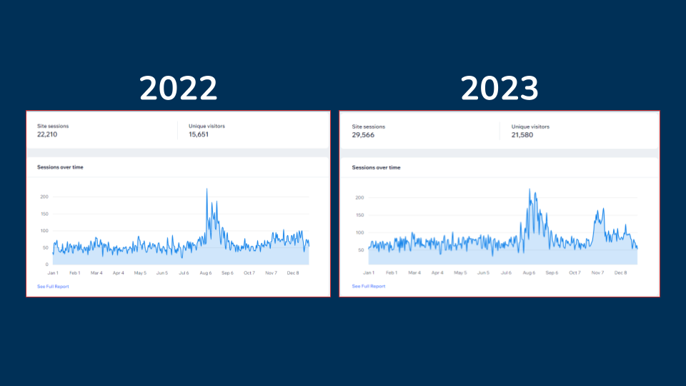
In terms of raw traffic, the Summerhays Orem website saw a significant boost throughout the year. By October 2023, it surpassed the amount received through the entirety of 2022.
- 37.88% more unique visitors to the website.
- 33.12% increase in site sessions
Search Results
The Summerhays website is more visible in search results, too. Here’s a graph from Google Search Console showing the upward trend.
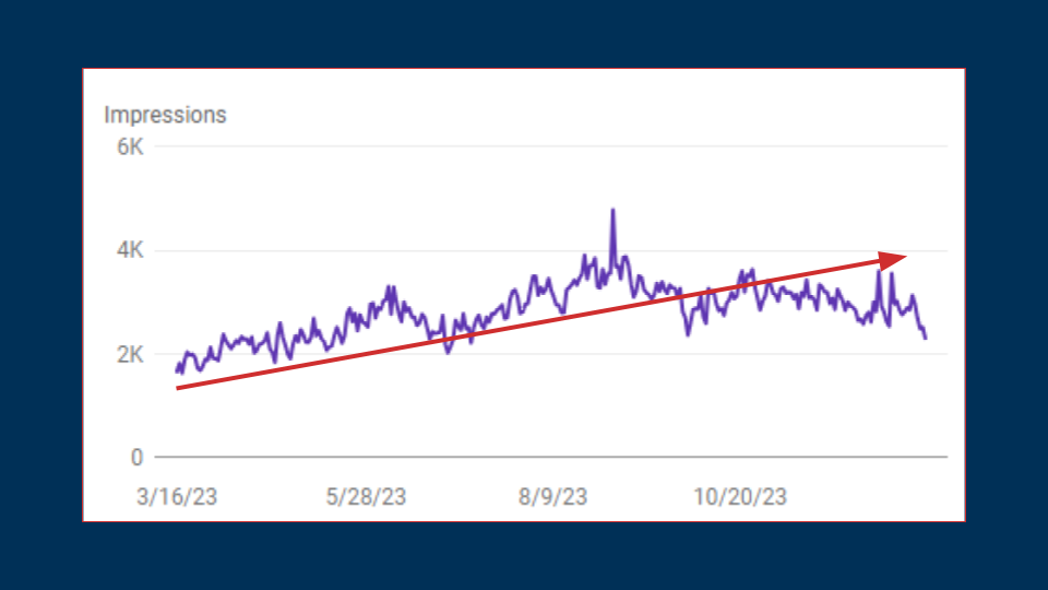
I started tracking search data in March, which had low visibility of roughly 1,600 impressions/day. It peaked at about 4,800 impressions in September, which is during the busy back-to-school season. Finally, it hovered at roughly 3,000/day through December.
Contact Submissions
More traffic is good, but it can also be a hollow vanity metric. Without generating leads, it’s meaningless.
While I can’t show any sales data, contact submissions are the next best thing.
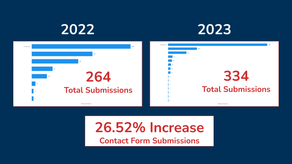
The bars on each graph represent different contact forms on the website. In 2022, there weren’t that many forms. In 2023, I prioritized putting new contact buttons and forms on every page.
It resulted in a 24.52% increase in contact submissions. And with more people contacting the store, more people will shop at Summerhays.
Key Takeaways
Here are some big takeaways I’ve gotten from doing this project:
You can see dramatic positive changes by optimizing existing content.
I’d say at least half my time was spent fixing what was already there. That alone makes a huge difference to both customers and employees.
Online appearance matters to customers and employees.
Having a clean and professional-looking website instills trust with potential customers. If it’s cluttered and confusing, it reduces their trust in your brand.
But what surprised me is how much the employees appreciate the changes to the website:
- They no longer see the website as a detriment or burden.
- They’re more confident in using the website as a tool to help with sales.
- Multiple employees have expressed how they’re “no longer embarrassed” to show the website to customers.
Good SEO & web design reduces your reliance on paid advertising.
While paid advertising can drive some results, it stops working as soon as you turn it off. It can be a key component in your marketing mix, but you shouldn’t rely solely on paid advertising.
Investing in SEO can reduce your expenses in other areas. And the best part is, it can work long after you’ve put in the effort.
